Testing for Accessibility
On this page:
As a web developer testing your code for accessibility errors is essential. Testing for accessibility is often treated as an afterthought and left to be conducted at the end of a project if at all. However leaving it until the end of the development cycle can be costly and significantly increase the time and cost of completing a project. Testing for accessibility must be taken seriously throughout all of the major stages of the development process.
Linters
When writing your code for a website it is important to begin testing it for accessibility as early as possible. This allows you to spot any errors early in the process and stop issues and extensive reworks further down to line. One of the easiest ways to do this is by using an Accessibility Linter. Linters are easy, automatic accessibility “spell checkers” for developers.
The benefits of using a Linter include:
- Automatically catch and fix accessibility errors in front-end source code while you type.
- Get detailed guidance on fixing unfamiliar accessibility issues.
- Create more readable, maintainable, and consistent code with standard rules.

Automated Testing
Once components and template pages have been created they should be tested for accessibility by running an automated scan on the page to identify the problems that can be easily and quickly spotted.
These scans will not only help you identify the most basic issues that need to be fixed, they will also allow you to be more efficient by looking for elements that can be easily automated, such as the presence of heading tags in the content, alt attributes on images, and proper colour contrasts.
Axe DevTools is the main tool we use for automated testing. Once a page has been scanned it will have a list of issues and allows you access extensive information about how to fix a problem and why it matters.

Manual Testing
Experts generally agree that about a third of accessibility problems can be found through automated testing. This means you should never consider automated testing to be sufficient to find all accessibility problems on a page. It is important to test a page by conducting manual tests also.
A good place to begin manual testing is by first evaluating input methods. An example of this is testing for keyboard accessibility. You should test for keyboard accessibility early on so that issues are caught and not repeated across an entire site.
Keyboard Accessibility
Many people cannot use a mouse and rely on the keyboard to interact with the web. People who are blind and some sighted people with mobility impairments use the keyboard or other assistive technologies that rely on keyboard commands, such as voice input. Websites need to allow people to access all content and functionality — links, forms, media controls, etc. — through a keyboard. Keyboard interaction may be the most critical step to increase the accessibility of a website.
Testing the Tab Order
When a user navigates a web page using the keyboard, they should be able to tab to elements that should naturally receive keyboard focus (e.g. links and buttons). Additionally, the tab order should be consistent with the layout of the content. Though the tab order should follow the reading order of the web page, it sometimes may be slightly different from the reading order of the content. As long as the tab order is logical and intuitive, though, it will allow users to understand and interact with the web page appropriately.
To check for tab order:
- Start with placing the cursor into the address bar or URL field in the web browser.
- From there, using the keyboard only, navigate into the web page using the Tab key.
- As you tab through the web page, check that the tabbing order makes sense according to the content on the web page. It is best practice for the tab order to follow the reading order of the web page.
- Tab all the way through the document to ensure the tab order is logical and intuitive.
Testing for Keyboard Functionality
To test for keyboard functionality:
- Check that you can tab to all the elements, including links, form fields, buttons, and media player controls. Make sure there are no actions or options that you cannot get to because they are only available on mouse hover or through click actions.
- Check that you can tab away from all the elements that you can tab into. A common problem is keyboard focus getting caught in controls and custom widgets and you cannot get out; it’s called the “keyboard trap.”
- For elements such as select boxes, sliders, or menu bars, check that you can move within the elements using ↓ key or ↑ key. (Make sure that you can navigate within the elements without causing a change in context, such as highlighting the first item in a drop down menu automatically selects that item.)
- Be sure you can use the Enter key or Space bar to select a specific item within an element.
Visual Focus Indicator
As users tab through links and form elements, they must be able to see where the keyboard focus is. Otherwise, they won’t know when to use the enter key to follow links or when to type in information in form fields. Keyboard focus should be visible and logical through the page elements.
There are a number of methods that can be used for visual focus. For instance, a vertical bar can be used when an empty text field receives focus, links can have a visible border or outline around them when they receive focus, or a button can change color when it receives focus. The goal behind testing for visual focus is to ensure users know where the keyboard focus is at all times.
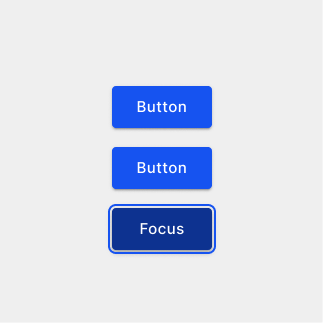
The bottom button has focus

When a website has no visual focus indicator the only way to see what element has focus is when a hyperlink destination is displayed by the browser in the bottom left corner.
Testing for Proper Focus Management
When dynamic content is generated based on a user’s input, it increases the challenge of making sure the keyboard focus is moved and visible to keyboard users throughout the entire interaction.
If a user triggers an element that generates new content on the web page, the keyboard focus should be shifted to the new content. If a user removes content from the web page, then the keyboard focus should be shifted to the next logical place on the page or to the element that triggered the change. This depends on the type and nature of the content. The idea is that keyboard focus must be returned to where users can continue from where they left off on the page after generating or removing the content. The keyboard focus must not get lost or moved to the top of the page where users may have to start browsing all over again.
When testing for focus management, find instances of content on the web page that is generated or removed based on interaction. Use the keyboard to test for focus management.
If the content generated by the user is a modal dialog:
- Ensure the keyboard focus is sent to the dialog when it is opened. For short dialogs, the focus can be sent to a default button in the dialog. For larger dialogs, the focus can be sent to the first heading in the dialog.
- Make sure the focus stays within the dialog. You must not be able to tab or navigate anywhere outside of the dialog.
- When the dialog is closed, either through a button or the Esc key, check that the focus returns to the element that triggered the dialog. It must not reset to the top of the page or disappear altogether.
If the content generated by the user occurs in the page itself (form validation success/error messages):
- Make sure the focus moves to the new content on the web page so users can find the content.
- If the content can be closed by the user, then focus must be shifted either back to where the user was previously on the web page or where the next logical interaction takes place. For instance, with a form error message, focus may be moved to the first input that contains an error.
Examples
- When a user clicks on an anchor and it animates down the page, the keyboard focus should also move to that section.
- When you in search overlay and you close the pop up, the keyboard focus should return to the search button that triggered the overlay to open.
- If you are filling out a form and there is an error, the focus should return to that error.
Testing for Keyboard Traps
A keyboard trap is when keyboard-only users navigate into an area of a web page that can only be escaped by using a mouse or some other input method that is unavailable to them. When these users encounter a keyboard trap, it seriously hinders the usability of the page. It is critical that users can easily move into and move out of areas of a web page by keyboard alone.
To test for keyboard traps:
- Navigate into the web page from the URL field using only the Tab key.
- As you tab through elements on the web page, be aware of any difficulties you encounter. You should be able to tab repeatedly through all focusable elements such as links, form controls, and menu items.
- For custom widgets, you should be able to tab to the widget and use the arrow keys to navigate within the widget. You should also be able to tab out of the widget.
- Use Shift + Tab to navigate the web page in reverse. Make sure you can tab backwards easily without the keyboard focus getting trapped.
Areas that are prone to keyboard traps include iFrames, dropdown menus, modals and popups. You should always test that you can leave a modal by pressing the esc key. This is one of the most common areas for a keyboard trap.
Touch Device Accessibility
Another input method that needs to be evaluated for accessibility is touch input. Since touch devices are so common and prominent now, content delivered through these devices need to be accessible and available to a wide variety of users.
Touch Target Size
Larger touch targets will greatly benefit users who experience hand tremors, imprecise hand movements, or who may need to use other parts of their bodies to trigger targets. The kinds of touch targets testers need to consider include, but aren’t limited to:
- Links
- Submit Buttons
- Radio Buttons
- Menus and Menu Items
- Input Fields and Comboboxes (Select fields)
- Custom Widget Controls (media players’ buttons, tabs)
Ideally the touch target size should be a minimum of 44px × 44px
Testing Touch Target Size
It is best to test for touch target size on mobile devices to see if sizing meets the best practice requirements above.
Touch Target size can be tested on a desktop computer using the 44×44 Pixel Cursor Bookmarklet
There are some other things that can be done to help ensure users with dexterity or motor disabilities can trigger targets.
Responsive Design: (Desktop) If the web page is responsive, shrink the viewport of the browser down to appropriate mobile sizing (tablet and phone).
Forms: When HTML labels are used in forms, users should be able to select the label itself to place focus on or in the form element. Test to see if the label can be selected. This is especially important for radio buttons and checkboxes as they are small in nature.
Links (by themselves) and Buttons: Ideally, the padding around links and buttons should also be a part of the target, not just text inside. Test to see if the padding around these elements can be selected. Using only the text inside the padding makes for a smaller target.
Links inline with text: Links that are surrounded by regular text should have enough characters to make them 44px wide. Extra padding for height may break visual layout, so it is critical that they are wide enough to trigger.
Check page content can be zoomed
You can quickly check whether you can adjust the content size while remaining accessible. Use the browser to zoom the content to 200% and ensure that text still fits in its containers and nothing odd happens to positioning of controls and other elements. Then keep increasing up to 400%. Ensure that the breakpoints match the design specifications. All content should be visible without requiring horizontal scrolling.
