Design Phase
This page details design considerations that will help you design websites that are user-friendly, intuitive, and above all accessible for everyone. Below are some areas to look out for in your designs that are typically where accessibility errors occur.
Visual Design & Colour
Visual content must be presented so that it is perceivable and understandable by people of differing abilities, including people who are colour blind or have low vision, or people who have cognitive, language and learning disabilities. It must also be presented in ways that accommodate a variety of screen sizes.
Text Colour Contrast
Users who have low vision need sufficient contrast in order to read. Make sure text achieves sufficient contrast against its background.
What to do
- Make sure text achieves sufficient contrast against its background
- Achieve at least the minimum contrast required for all text placed over images or gradients
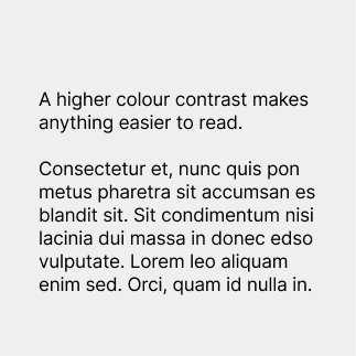
Minimum contrast for body text (less than 18 point regular or 14 point bold) is a 4.5:1 contrast ratio.
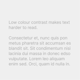
Don’t use text below a 4.5:1 contrast ratio as this makes it difficult to read.

Minimum contrast for large text (greater than 18 point regular or 14 point bold) is 3:1.

Don't use large text that contrasts less than 3:1 with its background.

Maintain a minimum contrast ratio for all text placed over an image

Don't place text on a background that falls below contrast minimums at any point.
Use the tools below to make sure you are achieving required colour contrast in your designs.
Use the Adobe Colour Contrast Checker Tool

Text on image background image a11y check
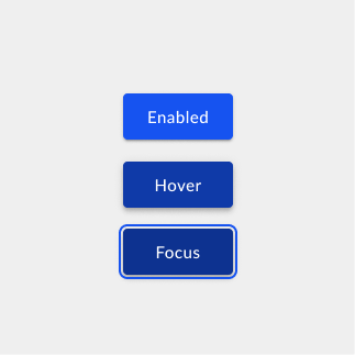
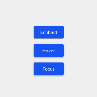
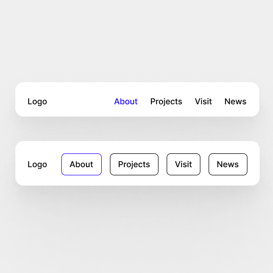
Visual States for Interactive Elements
Users with low vision need sufficient contrast to perceive the different visual states of a component, such as focused, selected, hovered, pressed, expanded, or checked.
All interactive elements need hover and focus states. This includes buttons, links, text fields, navigation elements, selection items (radio buttons, checkboxes), etc.
While hover and focus states are sometimes treated the same, they actually serve different purposes.
A hover state lets you know something is interactive. If you use a mouse, you can move your mouse over the screen and get a sense of what you can interact with when things are highlighted on hover.
A focus state indicates that an element is ready to receive input. This is different from hover because it’s communicating “you are interacting with this right now” instead of “you could potentially interact with this.” For example, a text field is ready for you to add text.
It is important to design for all of these states as they help people to understand what they are interacting with.
Visual treatments to indicate state changes may just be a difference of colour (such as a button changing hue). Others will involve altering the size or opacity of all or part of a component.
What to do
- Make sure visual states for components meet 3:1 contrast with adjacent colours
- Make sure focus and non-focus states meet contrast requirements
The focus state can inherit the hover state and use a 2px outline.
In this example it is not possible to know what the focus is on because all the buttons look the same.
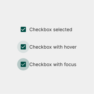
Ensure various states have good contrast.
Don’t use colour alone to convey information
Why This is Important
Information that doesn’t rely exclusively on colour is accessible to colourblind people. Colour by itself is not a reliable way to convey information because colourblind people experience it in many different ways.
Using visual attributes such as shapes, iconography, text, contrast, and spacing makes information accessible to colourblind people.
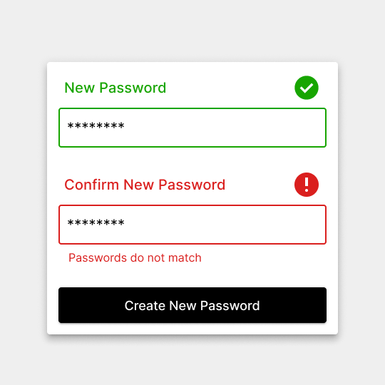
Help emphasise the difference through icons. Using helper text “Passwords do not match” draws attention and explains the error.
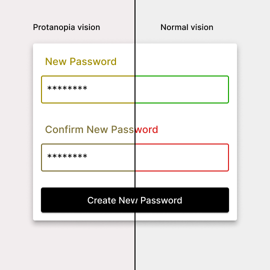
The difference between red and green is obvious to non-colourblind people, but for some colourblind users they look almost identical. While some people may be able to tell the difference, the subtle change might still lead to confusion and frustration.
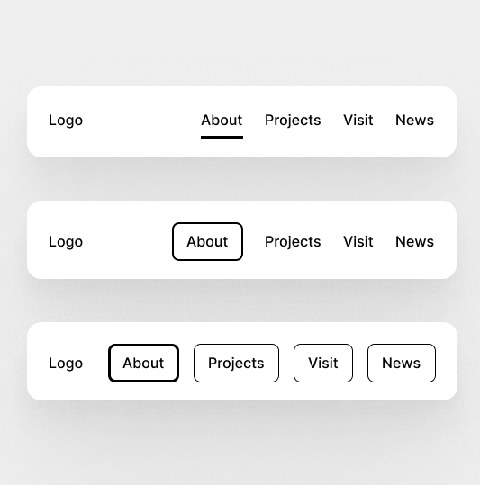
Adding an underline tab helps the current page stand out in the navigation.
Although this may be clear for users who aren’t colourblind. For some colourblind users they will be unable to distinguish between the different colours
In the Colourblind Accessibility Manifesto, they recommend the following rules for designing for colourblind users:
- Start with “Why?”
Ask if your design choices consider the needs of people with colour blindness. Changing the button colour on your website may seem insignificant, but it could make that website inaccessible to nearly 8% of men and 0.4% of women who have colour blindness.
- Don’t communicate only with colours
Colour can be one element of a differentiator in design, but don’t rely on colour to serve as the only element of distinction.
- Design with shapes
Colour-blind users can discern the difference between shapes far more easily than between colours.
- Choose the right copy
Avoid identifying tasks or requests to the user only through colour.
- Test your designs in black and white
This helps you evaluate the composition and the usability of your designs without the meaning provided by colour. - Rethink button states
Colour alone does not convey information for everyone. Use shapes and icons that indicate a button’s function. - Use contrast
Don’t default to using green and red to communicate things like product availability or pass/fail. Using icons, text, and high contrast colours such as blue and red will help many (but not all) people with colour blindness. - The smaller the item, the bigger the problems
Relying on small, coloured elements to signal important information, like updates or status, creates a huge barrier for colour-blind people.
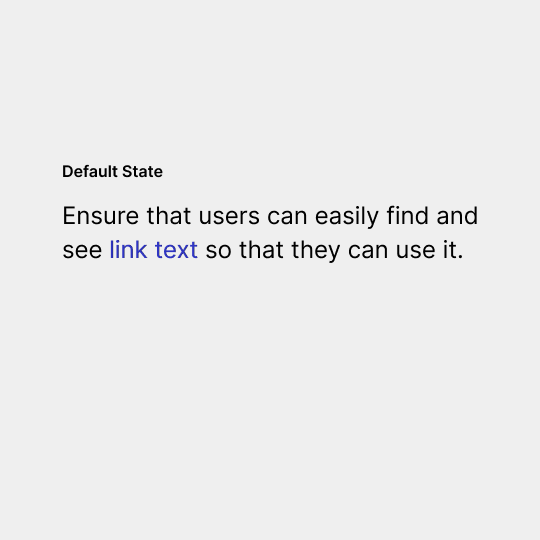
Link Text Contrast
Users need to easily identify links in content. Removing the underline or not having enough visual contrast with the surrounding text will decrease the discoverability, especially for users with low vision or cognitive disabilities.
What to do
- Confirm link text is underlined and/or has a contrast ratio of 3:1 with surrounding text. Achieving both is optimal.
- Colour alone must not be used to distinguish links from surrounding text unless the colour contrast between the link and the surrounding text is at least 3:1.
- An additional differentiation (e.g. underline, outline, highlight, etc.) should be provided when the link is hovered or receives focus.
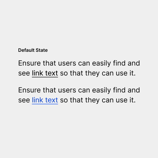
It is best practice for link text to always have an underline. This follows conventions and user expectations.
Don’t remove underlines from link text without sufficiently contrasting with surrounding text (3:1) and the background (4.5:1)
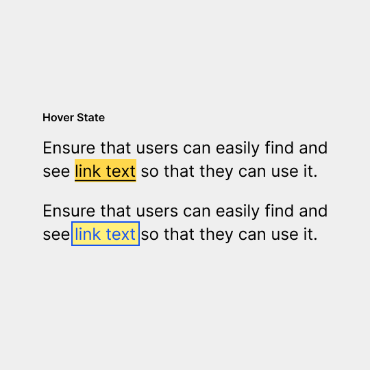
There should be an additional differentiation when a link is on hover or receives focus.
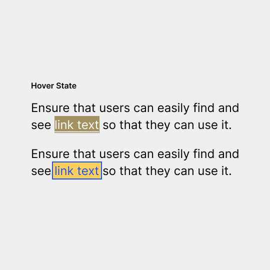
Although the hover text may look fine to users with normal vision, these two examples do not pass colour contrast guidelines.
WebAIM: Link Contrast Checker
Be Careful with Forms
Forms are an area in which there are typically accessibility problems caused by the designer.
In recent years we have experienced an oversimplification in form fields. Modern designs have foregone traditional identifying attributes and interactive affordances in favour of a more minimalist approach. Today’s forms typically lack two specific items that are vital for accessibility: clearly defined boundaries and visible labels.
Clearly defined boundaries for form fields are important for users with mobility impairments and those with cognitive disabilities. Knowing the location and size of the click target is important for people using a standard or adaptive pointing device. Users with cognitive disabilities may have difficultly finding and interacting with fields without common visual cues.
Labels tell the user the purpose of the field, are still visible when focus is placed inside of the field and remain even after completing the field. Placeholder text should not be used as a replacement for a visible label.
A form label should be persistent and always shown.
Placeholder text should not replace a form label as it disappears when a user starts typing.
The Problem with Captcha
Requirements on websites to prove that you’re not a robot (such as to complete a financial transaction, fill in a form, or to sign up to a newsletter), are often not accessible. CAPTCHA is a popular security method used and is generally easy for people with normal eyesight to complete, but it presents a lot of problems for people who are blind, have low vision or use screen readers. Here are some alternate methods that are more accessible:
- Email and text message verification codes
- The honeypot method — this system tricks bots into making submissions using an invisible form
- Logical or mathematical tests — keep the answers to their questions simple so that there is not too much cognitive overload for users.
- Offer multiple options that work for multiple types of disabilities
Read more about the Captcha problem and accessible alternates
User Experience
The website you design should be predictable and consistent. How each element relates to the system as a whole should be clear and meaningful, to avoid confusion for the users.
- Repeated navigation patterns should be consistently presented throughout the interface.
- Functionality should be designed to be easily discoverable.
- Users should be informed when setting focus on a control triggers a change of context.
- Having different ways of navigating and searching ensures that users can easily find what they’re looking for. Consider links and other mechanisms to bypass blocks of content and provide a search function or other features to improve navigation and discoverability.
- Use table of contents when appropriate which make it easy for users to see content at a quick glance.
Movement and Flashing
Elements on the page that move, flash, or animate in other ways must be able to be stopped, and should not distract or harm the users.
- You should be able to pause, stop, or hide moving or animated content.
- Video and audio files should not be set to auto-play.
- There should be no flashing or blinking effects faster than 3 times per second.
