Writing Accessible Code
On this page:
It is important that developers know how to use the built in features for accessibility as not to exclude any users from applications. There is also an overlap between websites that are accessible and SEO performance. Websites that are accessible to everyone are more likely to rank higher on search engines. HTML has many features to help build accessible websites and on this page we will discuss many of them.
Semantic Elements
Semantic elements are HTML elements that give the page meaning. Generally as developers we often use the <div> tag as a container for HTML elements but it is extremely important to make use of the 115 semantic elements available to us to give a page more description and structure. <div> and <span> for example give no meaning to the content. Examples of tags that give description are:
- <section>
- <aside>
- <footer>
- <article>
Try to use the semantic elements anywhere you can.
Landmarks
Landmarks are very important to describe sections of the web page e.g. header, main content and footer. This allows blind users using a screen reader to have the ability to navigate a page better. One way to visualise landmarks is to use the Landmarks chrome extension.
Generally semantic elements have built in landmark attributes but as a developer there are often times where we need to add landmarks to other elements. With the role attribute we can simply add a landmark e.g. <div role=”main”>.
Some role values include:
- Navigation
- Main
- Contentinfo
- Banner

Meaningful and decorative images
It is essential that all images on a website have an alt attribute or are marked as decorative. This allows users using a screen reader to be able to read descriptions of images which may give context to the content on the page.
We use decorative images when the image does not give a user understanding of functionality on a web page. Can you remove the alt with no impact? Then it’s probably a decorative image. To set an image as decorative use an empty alt tag e.g. alt=””.
When an image requires an alt description, we must be as descriptive as possible. For example:
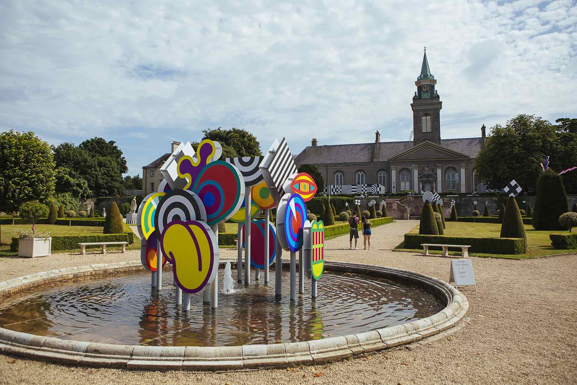
alt=”Exterior installation photograph of a fountain in a formal garden, an installation of colourful shapes is in the centre of the fountain.”
The value of the alt attribute should describe the image, or even better the intention of the image.
Link states
As developers it is important to leverage full use of link states. It is often that we overlook some of them:
- Unvisited
- Visited
- Hover
- Active
- Focus
A visited state can help a person with short-term memory loss to understand which content has been read. A hover state can help a person with reduced muscle control to know when to click. A focused link helps keyboard users to know which link they are about to activate.
Heading Levels
While developing a website we usually visit heading levels when we want to optimise our site for SEO. Headings are also important for accessibility when users require the use of a screen reader. Ensure that heading levels are not skipped and are in proper hierarchical order.
Visual focus or Keyboard focus
Users who cannot use a mouse often use a keyboard to navigate a website. Earlier we outlined the importance of link states, it is important that we make use of the focus state of a link to allow a user like this to navigate a website. Usually a focus state of an element adds a border or outline styling.
The easiest way to handle visual focus is to leave it for the browser to handle. This has many benefits:
- It is easily recognisable.
- You don’t have to manipulate code.
Skip to main content button
Usually a website’s navigation system has many links which causes an issue where if a user navigates to a new page they must then keyboard tab through the navigation again to get to the content. A skip to the main content button fixes this.
Labels
If an element does not have an aria-label by default in some cases it is important to add one to define the name of the element. Aria-labels can be used in situations where text that could label an element is not visible. When there is visible text for an element e.g. a form label, use the aria-labelledby alternatively.
The purpose of aria-label is the same as aria-labelledby. Both provide an accessible name for an element. If there is no visible name for the element you can reference, use aria-label to provide the user with a recognisable accessible name.
